Introduction: The Age of Declarative, Layout-Smart UIs
For over a decade, frontend developers have operated under a silent compromise. We built complex, dynamic layouts using CSS, but whenever we needed components to be aware of their surroundings, react to user interactions, or dynamically tether to other elements, we were forced to write JavaScript. We relied on window resize event listeners, computed bounding boxes, and complex class-toggling scripts. While functional, this approach introduced a hidden cost: performance overhead, code complexity, and the dreaded Cumulative Layout Shift (CLS).
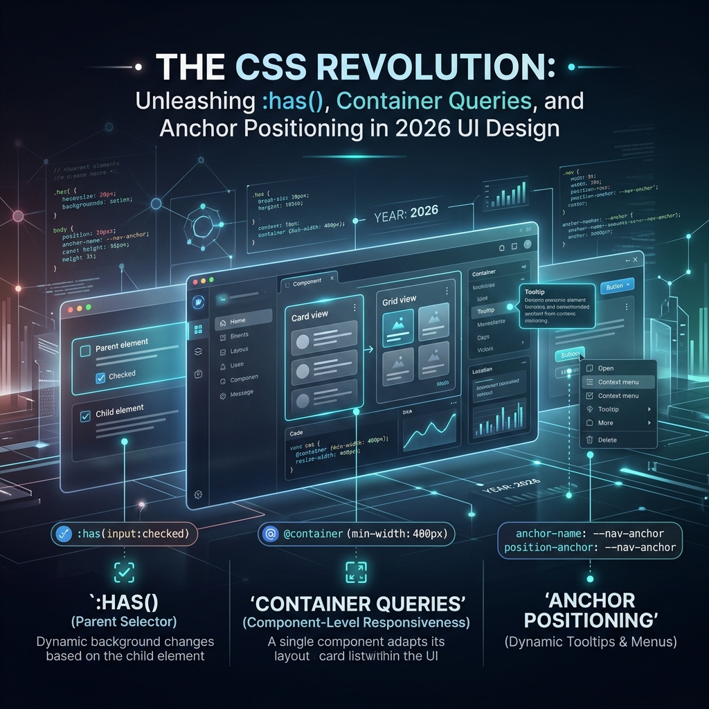
In 2026, the web development landscape has shifted. The CSS revolution is here, spearheaded by a powerful trifecta of native APIs: the :has() relational selector, Container Queries, and Anchor Positioning. Together, these features transform CSS from a static styling language into a state-aware, context-sensitive layout engine. By shifting dynamic positioning and conditional styling from JavaScript straight to the browser's layout engine, we can create incredibly smooth, responsive interfaces that completely eliminate layout shifts. In this comprehensive guide, we will deep dive into these three game-changing technologies, look at production-ready code examples, and explore the technical reasons why they make Cumulative Layout Shift a thing of the past.
The Parent Selector Unleashed: :has()
Often referred to as the holy grail of CSS, the :has() relational selector allows developers to style a parent element based on the presence, state, or arrangement of its descendant elements. Historically, CSS could only select elements moving down the DOM tree. If you wanted to style a card differently because it contained a hero image, or update a form field wrapper based on whether the input inside it was invalid, you had to write JavaScript to toggle CSS classes on the parent element.
With :has(), this logic is handled natively, declaratively, and instantly by the browser. Let's look at a common implementation pattern for a card component that needs to adapt its layout structure depending on its children:
/* Standard Card Component Layout */
.product-card {
  display: grid;
  grid-template-columns: 1fr;
  gap: 1rem;
  padding: 1.5rem;
  border-radius: 8px;
  background-color: var(--bg-card);
  border: 1px solid var(--border-neutral);
  transition: all 0.3s cubic-bezier(0.4, 0, 0.2, 1);
}

/* If the card HAS a hero image, change layout to a two-column grid */
.product-card:has(.card-image) {
  grid-template-columns: 300px 1fr;
  align-items: center;
}

/* Style form group based on invalid states of child inputs */
.form-group {
  border-left: 4px solid var(--color-neutral);
  padding-left: 12px;
  transition: border-color 0.2s ease, background-color 0.2s ease;
}

/* Highlight the whole form group if the user types an invalid input */
.form-group:has(.form-field:invalid:focus) {
  border-left-color: var(--color-error);
  background-color: var(--bg-error-light);
}
How :has() Prevents Layout Shifts
In traditional Single Page Applications (SPAs), styling parents based on child states created a synchronization gap. When a page loaded, the browser would render the initial static HTML/CSS. Once the JavaScript bundle loaded and hydrated (e.g., in React, Vue, or Angular), the framework would run its lifecycle methods, detect the state of child components (like an asynchronous image loading or an input error), and append a class like .has-image or .is-error to the parent container. This delayed class injection forced the browser to run a secondary layout pass, causing elements to visually jump—a classic layout shift.
Because :has() is evaluated directly by the browser's CSS parser during the initial Style Recalculation phase (before Paint and Composite), the layout is correctly determined on the very first frame. The browser knows the structure of the DOM tree before it paints the pixels. By bypassing JavaScript execution and dynamic class injection, :has() ensures that conditional styling behaves with rock-solid visual stability from the millisecond the page renders.
From Viewport to Context-Aware: Container Queries
For years, responsive design meant one thing: Media Queries. We queried the global screen dimensions (viewport width) and adjusted our layouts accordingly. While this worked for simple page layouts, it was fundamentally flawed for modular component-driven architectures. A card component placed in a wide main content area should look different than the exact same card component placed in a narrow sidebar. Doing this with media queries required writing complex context-specific class overrides or using JavaScript resize observers to measure the parent's width.
Container Queries solve this by allowing components to query the size of their parent container rather than the screen viewport. This shifts the responsive paradigm from "viewport-aware" to "context-aware". Let's look at how to set up container queries in practice:
/* Step 1: Define the container context on the parent element */
.widget-area {
  container-type: inline-size;
  container-name: card-container;
  width: 100%;
}

/* Step 2: Set the default, mobile-first styles for the component */
.promo-card {
  display: flex;
  flex-direction: column;
  gap: 1rem;
  padding: 1rem;
  background-color: var(--bg-surface);
}

/* Step 3: Adapt the component layout based on the parent's width */
@container card-container (min-width: 500px) {
  .promo-card {
    flex-direction: row;
    align-items: center;
    justify-content: space-between;
  }
}

/* Using Container Query units for fluid typography */
.promo-card .card-title {
  font-size: clamp(1.2rem, 3cqw + 0.5rem, 2rem);
}
Eliminating Layout Shifts with Container Sizing
When relying on JavaScript ResizeObserver to build container-aware components, a layout cycle usually looks like this: the parent renders, the JS observer fires, measures the container width, sets a state property, triggers a re-render, and modifies the DOM styles. This asynchronous cycle happens on the main thread and is guaranteed to cause a layout shift, as the initial render must visually transition into the newly calculated container-based layout.
CSS Container Queries run entirely within the browser's layout engine. By declaring container-type: inline-size, you instruct the browser to perform layout containment on that element. The browser calculates the container's layout first, and then immediately lays out the children inside it using the @container rules in a single layout pass. Using container query units (like cqw and cqh) also allows text and child elements to scale fluidly during the initial paint, eliminating the layout thrashing that occurs when resizing windows or dynamically inserting sidebar elements.
Tethering the Web: The CSS Anchor Positioning API
Popovers, dropdown menus, context menus, and tooltips are notoriously difficult to implement. Because they need to float on top of other content without being clipped by parent overflow containers (overflow: hidden), developers typically had to place them in portals at the root level of the DOM and use heavy JavaScript positioning libraries (like Popper.js or Floating UI). These libraries listen to scroll events, calculate bounding rectangles in real-time, and apply absolute inline offsets to align the popover to its target trigger. This approach is highly prone to visual lag and Cumulative Layout Shift.
The native CSS Anchor Positioning API solves this by letting you define an element as an "anchor" and tether a target floating element to it directly in CSS. Here is how you can set up a tooltip that floats underneath a button and automatically falls back to the top if space is restricted:
/* Step 1: Assign an anchor name to the trigger button */
.anchor-trigger {
  anchor-name: --tooltip-anchor;
}

/* Step 2: Target the tooltip popover and reference the anchor */
.floating-tooltip {
  position: fixed;
  position-anchor: --tooltip-anchor;

  /* Align the top of the tooltip to the bottom of the anchor button */
  top: anchor(bottom);
  /* Center the tooltip horizontally relative to the anchor */
  left: anchor(center);
  transform: translateX(-50%);

  /* Step 3: Handle viewport boundaries with fallback strategies */
  position-try-fallbacks: flip-block, flip-inline;

  margin-top: 8px;
  background-color: var(--color-bg-dark);
  color: var(--color-text-light);
  padding: 8px 12px;
  border-radius: 4px;
  box-shadow: 0 4px 12px rgba(0, 0, 0, 0.15);
}
Eliminating the Jitter: Dynamic Fallbacks and native Popover API
JavaScript floating position calculators are notorious for causing "jitter". When a user scrolls the page, the JavaScript event loop handles the scroll event, calculates the new position of the anchor, and updates the floating element's styles. If the main thread is busy, the floating element visually detaches from the trigger button and lags behind, creating a visible layout shift. Furthermore, if the floating element hits the edge of the viewport, the JS library must calculate a fallback position, causing the element to suddenly teleport and shift adjacent elements if not properly isolated.
By shifting this calculation to CSS, positioning is resolved during the browser's layout phase before paint. By using position-try-fallbacks, the browser handles boundaries natively. If the tooltip cannot fit below the anchor, the browser evaluates the fallback (e.g., flip-block, which flips it to the top) and paints it in the correct location on the very first frame. This avoids the asynchronous frame delay entirely, producing zero-jitter, pixel-perfect alignment even during rapid scroll events.
Eliminating Layout Shifts: The Technical Underpinnings
To truly appreciate how this modern CSS trifecta eliminates layout shifts, we need to understand the browser's rendering lifecycle. The pipeline consists of five critical steps: parsing the HTML/CSS, Style Recalculation, Layout (determining the size and geometry of elements), Paint (creating draw calls for pixels), and Compositing (assembling layers on the GPU).
When we use JavaScript to handle layout logic, we introduce a performance pattern known as Layout Thrashing. JavaScript reads layout geometries (e.g., calling getBoundingClientRect() or offsetWidth) and then writes new styles to the DOM. This force-interrupts the browser's optimized pipeline, demanding immediate style recalculation and layout updates. The visual result is a Cumulative Layout Shift, which hurts both user experience and search engine optimization rankings.
By moving this logic to CSS:
- State transitions are declarative: The browser knows exactly how elements should behave under different parent states (
:has()) and sizes (Container Queries) during the Style phase, resolving all structural layout rules in a single, highly optimized calculation pass. - Positioning is offloaded to the layout engine: Anchor positioning evaluates coordinates in the Layout step. Since it is native, the browser can perform optimizations like keeping the anchor-positioned elements in the top layer (via the Popover API), removing them from the standard page layout flow and ensuring they cannot trigger reflows of neighboring elements.
- Fluid scaling prevents jumps: Combining Container Queries with native sizing mechanisms like
aspect-ratioallows developers to reserve the correct aspect box for images and complex layouts. The browser allocates layout boxes early, allowing text and content to scale proportionally without sudden height reflows when container boundaries shift.
Best Practices for Implementing CSS-Native Layouts
- Separate layout grids from container contexts: Never apply container queries to the same element defining your main layout grid. Instead, create a wrapping element that establishes the container context, and place your query-dependent component inside it. This isolates layout calculations and prevents infinite containment loops.
- Prefer inline size queries: For container queries, stick to
container-type: inline-size. Querying the block-size (height) is highly prone to layout feedback loops, because adding content causes a container's height to expand, which triggers a style change, which might then shrink the content or change the height again. - Pair Anchor Positioning with the Popover API: Place anchor-positioned elements (tooltips, dropdowns, dialogs) inside the browser's native top-layer using the
popoverattribute. This ensures they render above all other layers without needing highz-indexvalues or risking container clipping. - Design robust fallbacks: Although browser support is near-universal in 2026, ensure your components degrade gracefully on older engines. Wrap advanced query structures in
@supports (container-type: inline-size)and provide standard media queries as baseline layouts.
Conclusion and Next Steps
The CSS revolution of 2026 marks the end of an era where JavaScript was the only tool capable of building stateful, context-aware user interfaces. By mastering :has(), Container Queries, and Anchor Positioning, frontend developers can write simpler, lighter, and more maintainable codebases. More importantly, we can build web applications that load faster, feel snappier, and offer bulletproof visual stability by eliminating layout shifts once and for all.
As you build your next UI, ask yourself: does this behavior really require JavaScript, or can it be handled natively in CSS? The answer is increasingly the latter. Embrace these modern CSS tools and lead the charge towards a faster, layout-stable web.